Dear Guest,
Please register or login. Content don't create itself!
Thank you
-
 Re: 44 Bikes

Originally Posted by
christian

Kris - saw that you designed the Winter Bicycles branding for Eric, which is among my favorite off all bicycle-related branding. Can you share more with us about the process you guys used to arrive at the final product? It's terrific!
Thanks for the kind words. So the long winded version goes something like this:
Eric was great to work with on his branding. The process started with his inquiry after I had designed the Oregon Handmade Bicycle Show's logo and subsequent show poster(s). I had a few conversations with him via internet and then over the phone to pick his brain on where Winter had been, where it was presently and where he was planning on going with the brand. I also asked him at length about the name itself and had him build that backstory for me to better understand it all. Most times I ask a few questions, bigger picture ones like this, and then sit back and listen. My job is to really pay attention so I can see the forest through the trees as I am an outside perspective. I know the industry well and feel I have a knack for sifting through everything to distill the main concepts.
Eric was very helpful as he had a bit of direction for me. We exchanged some inspiration type images of styles he was interested as well as some quick pencil/pen sketches. Which is great as that sets up restrictions right from the start by which the design process can thus be channeled. Too much freedom or "I don't know what I want until I see it" can lead to the designer just doing what they want to do and that might not be the best solution. This same process is applied in a fashion when I build a client a bike. Several question, followed by lots of listening and distilling. But it's important to develop concepts that are right for the client and have a bit of the designer injected into them as well so if you stand back and look at all the work you've done, a style begins to emerge however, as one logo, they stand alone by themselves and really relate to the brand it was intended for. That's tricky of course, but a signature is still present.
After those first few conversations, and a design direction is set, I take 1-2 weeks to generate concepts. I've found depending on the client, more can be dangerous as they can get overwhelmed. This is where understanding the client inside and out becomes paramount. Some like more, some like less - and you can decipher this if you ask all the right questions and do the listening I spoke about. I felt with Eric, I could pitch him 3-5 concepts and we'd narrow it down quickly. 2 safe, one dead in the middle and then 2 perhaps "out there". Most times the 4 or 5th concept is what I'm actually looking to persuade the client to going after. Other times that first round is a good way to get a reality check on your understanding of the aesthetic. (which was important on this design - I tested some waters with that first round) I leave a safe version so some of that "out there" can be funneled into that safe spot. Eric also had a certain look and feel, along with some existing art (cherry blossoms), so that needed to be updated and integrated in some fashion. So this went to about 4 or 5 rounds until we narrowed down the final design. As we moved along, he would print out some of the examples and draw directly on the concepts for me to better understand what he was after and to just brainstorm on the concepts (this was great, and is rare to have a client like this). Typically it does take 3-5 rounds of back and forth. The first 2 most likely set direction and then the last few just whittle away and narrow down the scope. Certain aspects are taken from one design and applied to the next. As I go along, one thing inspires the next and it builds momentum on itself. Often times, I'll have more than one of these projects going at once which takes some care but really helps to drive each of the separate design projects as I can put one away for a few hours and work on something else, then come back to another. Sometimes I'll actually be down in the shop, change gears and come back up to the studio and nail the design in a few minutes or it can happen the other way around too. Design stops, and bikes get built even better.
But flourish without over doing it was also a key take away and general design requirement. These "phases" can be quick or take some time to nail down, again, depending on the client. Some can be really picky, and really sweat the details. Which is fine, but it just requires more patience. Eric "gets it" so he was really great to work with - he let me do my job and I listened to what he wanted and delivered what he needed. I think the end result really speaks to the Winter brand as a whole, but brought it to that next level, and really tightened up the presentation so each Winter is a stand alone piece, but relates back to a family of objects. The essence was always there, but his original DT Script was pretty stiff looking. His work has a lot of flow, utility too, but lots of flow and harmony. I tried to inject that into the design as well.
I'll inquire with Eric, but I have pretty much all of the rounds of the work from start to finish and may be interesting to post up as a downloadable link so everyone can see where his branding started, where those little moments in space start to gel, and then wham, (in this case Round 5) he's got his logo/s. The icon he uses actually happened in Round 4 of the design, and the script happened in the round after that almost immediately.
-
 Re: 44 Bikes
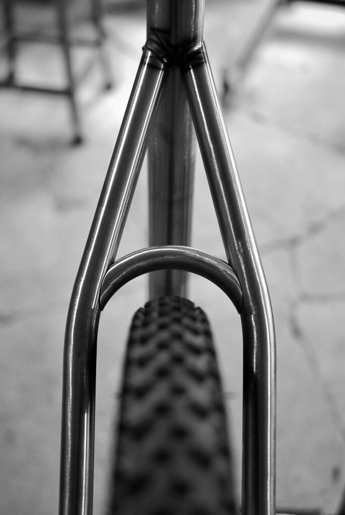
From today's effort... More of this 650b this friday on FNL 224.
ST Brace Junction : Franky's 650b by 44 Bikes, on Flickr
-
 Re: 44 Bikes

Originally Posted by
fortyfour

Thanks for the kind words. So the long winded version goes something like this...
Thanks for taking the time to post this, Kris. I'm going to send the text, if you don't mind, to all the designers I work with. It's a great summary of an effective process and the Winter design is a perfect example of the process working.
-
 Re: 44 Bikes
-
 Re: 44 Bikes
Kris,
I notice that all, if not 99%, of your frames have the top line of the seat stay make a continuous line from the top tube, viewed from side on. Is this a deliberate silhouette thing going on here or a consequence to allow a nice line for the rear deraileur or brake housing, whether its internal or external, to then follow the bottom edge of the seat stay?
-
 Winter Branding : BCS Dept. of Raw Power
I spoke with Eric at Winter this morning and he's happy to share the initial concepts that I produced for him. THIS LINK is a direct link to a zip file (about 9mb). You will notice that there are several PDF's and a subfolder titled "Winter Concepts". Within that folder includes several things: Some inspiration images to provide initial direction (I also have a very large clipping file of a lot of old ad art, catalogs etc along with many books I often reference - I believe I studied up heavily on my Taschen "All American Ad's of the 20's"), drawings from previous art that Eric provided, and then some drafts done by Eric when we went back and forth on some concepts where he physically drew his thoughts on paper. This was very helpful as I stated as I will often do this myself as things come together. The PDF's include 4 of the 5 rounds (I believe Round 3 only had 1 or 2 tweaks to something early on regarding some fine detail exploration). And of course, the final art labeled accordingly.
Start with the concepts folder, view pdf's in order and then view the final art pdf last so you can see the progression.
I've stated this elsewhere, but as I'm generating concepts, most times it starts as very simple pencil sketches that are scanned and then traced in Adobe Illustrator and then the line art is refined from there. Sometimes I'll even print out a set of letters or a logo and work over top of this using Graphics 360 (kind of a translucent sketch paper) or sketch directly onto the printout and then scan / import this back into Illustrator. That's if a particular form is just not resolving itself and I just need to get down to business. I know I did this a few times on that "W" in Winter's logo script. Getting that flourish just right was key to set up the flow - basically the whole logo script has the movement of that W's flourish. His original script was upright too, so I retained some of that look and feel in the new letter forms but pushed it further to give it that newness but also let it not completely deviate from the path he had already started. Starting with the basics (Pencil + Paper) allows you to quickly generate concepts without them being too precious. I feel as though this also really lets you feel out the forms too unlike sketching directly via a computer - I know if simulates it, but there's nothing like the drag of a nice sharp HB pencil on some rag! (That's just me)
Also of note: I knew from the start that his logo and icon (HT Badge) would be reproduced in a type of metal. Most likely a casting. I believe he settled on a pewter piece. So I knew it had to not be tonal, but simple black and white and something that can create some relief and set up the ability to include a patina to give it that relief. That is why much of his art is black and white to start so that when the badges were made, it gave some room for the artisans to add some relief and interpretation through their individual processes (I was a goldsmith, so I know the craft). But also via the design process, simple black and white allows us to concentrate on the forms rather than let color dictate our decisions.
Enjoy this exclusive look behind AND under the curtain.
-
 Re: 44 Bikes

Originally Posted by
devlin

Kris,
I notice that all, if not 99%, of your frames have the top line of the seat stay make a continuous line from the top tube, viewed from side on. Is this a deliberate silhouette thing going on here or a consequence to allow a nice line for the rear deraileur or brake housing, whether its internal or external, to then follow the bottom edge of the seat stay?
That "low slung" look is starts really as a result of the tech type terrain we have here in New England. Especially around this neck of the woods, many times if you have to step off or take a dab your foot will be lower than where the wheels are with the ground, be it a bench cut type trail, up on a wall, or crossing a rock wall, various obstacles etc. You want some room between you, your junk and the top tube. So I wanted to give as much room as possible. That visual line isn't truly going strait to the dropout. It's typically above it and I try and keep the ST brace about 3-4 inches total. This way when the post is inserted, based on my drawings and measurements from the rider, there is post below the bottom of the TT junction. That's important especially in this type of design I feel. You're not putting that "stub" of the seat post between the brace and the top tube. After all, that seat post is a giant lever arm so I'm attempting to add some support by utilizing the length of the top tube to counteract that lever. Visually, that's very appealing to the eye where you have that strait line:
Functionally, it lends itself to more standover, but by not putting that line strait from head tube to dropout, you're not feeling every hit translated up and through the entire frame. Add in 5/8 seat stays, put some curves in there, raise them up a bit along with extra seat post extension and form the chainstays in just the right locations and you've got stiffness where you want it and softness where you need it. A carbon post has some serious dampening qualities to it when given some extension. I know the above client was coming from a full suspension commented at the end of the day (I met him at the Kingdom Trails monday after NEMBAfest to hand off his completed custom bicycle and then for us to go for a ride to dial in setup) he was so surprised that he didn't really notice he was on a hardtail. He had some hesitance to go back to a hardtail, liked the simplicity behind it, but was concerned he'd be really beat up on long days. The big wheels along with all the above changed his mind. He was very happy to say the least.
Also, I've been opening up that rear triangle a bit. The more acute you make that angle, the higher the forces are at that seat tube / seat stay junction. The more you open up that angle between seat tube and seat stay, you lessen the compressive forces at that joint. It also sets up this:
Whether it's internal or external top tube routed cables, the cables nest in nicely if you bump those seat stays just a bit above the top of the top tube. Kind of a convenient functional result of a greater purpose. It makes the transition smoother, so better shifting so the cables don't have to change so much direction or have more bends to go against. The smoother the line, the smoother the shifting with less drag IMO. I've also noted that for mountain bikes like this, it makes sense to put the internal cable routing on the sides so I can either place them below or have the derailleur line under and the brake line over (if cable actuated it makes more sense to do this, other times not or depending on the disc brake type and how that hydro line is connected at the caliper). You'll also notice that the guides are asymmetrical too. Even on the top tube routed external cable guides I route them in the best fashion to maximize efficiency in shifting and feel if shouldered/handled. On Cross and road bikes that use disc brakes, I've noticed that it's better to place the cables just above the bottom of the top tube because the top tube is much, much higher:
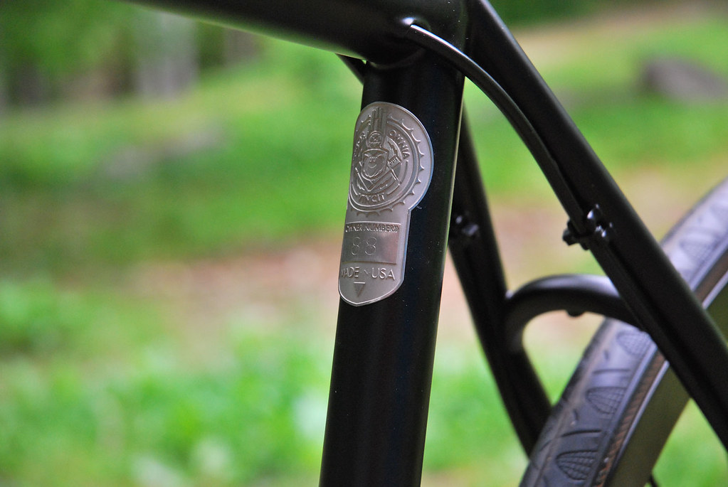
In a bigger picture idea, there is definitely a look and stance I'm after that makes a 44 Bikes, a 44 Bikes! Especially my mountain bikes. I feel I had to go way out and push the concept and build something like this:

or this one:

Before I came full circle to come back to what I refer to as my 44 TRAD. It has all of the refinements, handling qualities, and increased standover that is above, but I feel it still has that definite "feel" of what makes a 44 Bikes unique but in a traditional New England hardtail look like this:
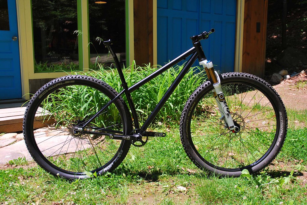
Or this:

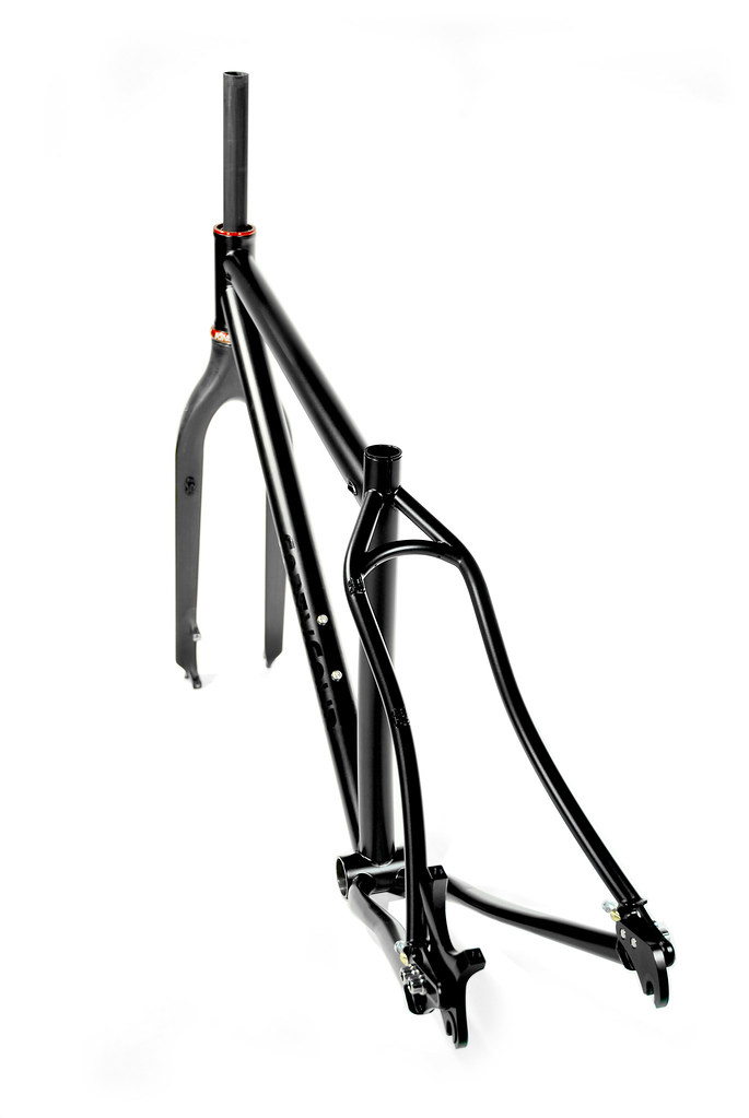
-
 Re: 44 Bikes

Originally Posted by
fortyfour

Do you use stainless tube for internal routing? Does welding affect to brazing, HAZ seems to reach to brazing?
-
 Re: 44 Bikes

Originally Posted by
J_K

Do you use stainless tube for internal routing? Does welding affect to brazing, HAZ seems to reach to brazing?
Welded 304 Stainless .25" O.D. tubing is used (Sourced in 36" lengths from McMaster - I wish it came in 24" lengths...). It's a continuous tube inside the top tube so it makes for running cables a snap and a worthwhile weight penalty for setup IMO. Less brazing too and no chance of any corrosion build up if I used a brass tube. I use 304 vs 316 as it's a bit less expensive and still has good corrosive resistance. Welding HAZ does/did not effect the brazing with my experience to this point since the welding "zone" is so localized.
-
 Re: 44 Bikes

Originally Posted by
fortyfour

Welded 304 Stainless .25" O.D. tubing is used (Sourced in 36" lengths from McMaster - I wish it came in 24" lengths...). It's a continuous tube inside the top tube so it makes for running cables a snap and a worthwhile weight penalty for setup IMO. Less brazing too and no chance of any corrosion build up if I used a brass tube. I use 304 vs 316 as it's a bit less expensive and still has good corrosive resistance. Welding HAZ does/did not effect the brazing with my experience to this point since the welding "zone" is so localized.
Thanks for the info Kris!
What rod do you use for brazing, 56% silver?
-
 Re: 44 Bikes

Originally Posted by
J_K

Thanks for the info Kris!
What rod do you use for brazing, 56% silver?
Correct. Either sourced from Henry James or from Prince & Izant.
-
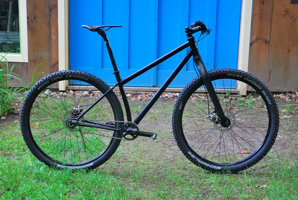
 Singlespeed love
-
 Re: 44 Bikes

Originally Posted by
fortyfour

That "low slung" look............. cut
Information overload. In a good way. Really appreciate the detailed explanation as there is always lot of back ground info that makes the difference to the understanding.
(runs to bank to squirrel away more deposit money)
-
 Re: 44 Bikes

Originally Posted by
fortyfour

Correct. Either sourced from Henry James or from Prince & Izant.
Thank you for the info Kris, I really appreciate your willingness to share your info!
-
 Re: 44 Bikes
-
 Re: Singlespeed love
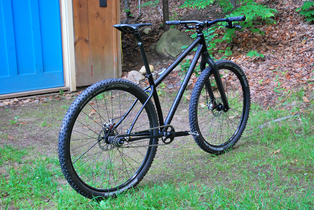
Damn Kris, that is a really nice-looking bike! Pared down to perfection.
-
 Re: Singlespeed love

Originally Posted by
chancerider

Damn Kris, that is a really nice-looking bike! Pared down to perfection.
Thank you. A new set of brakes in a bit and it will be right where I want it. Then just in time to build another of course :)
-
 Back Purge Love
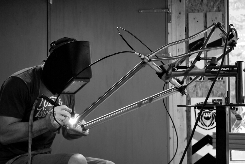
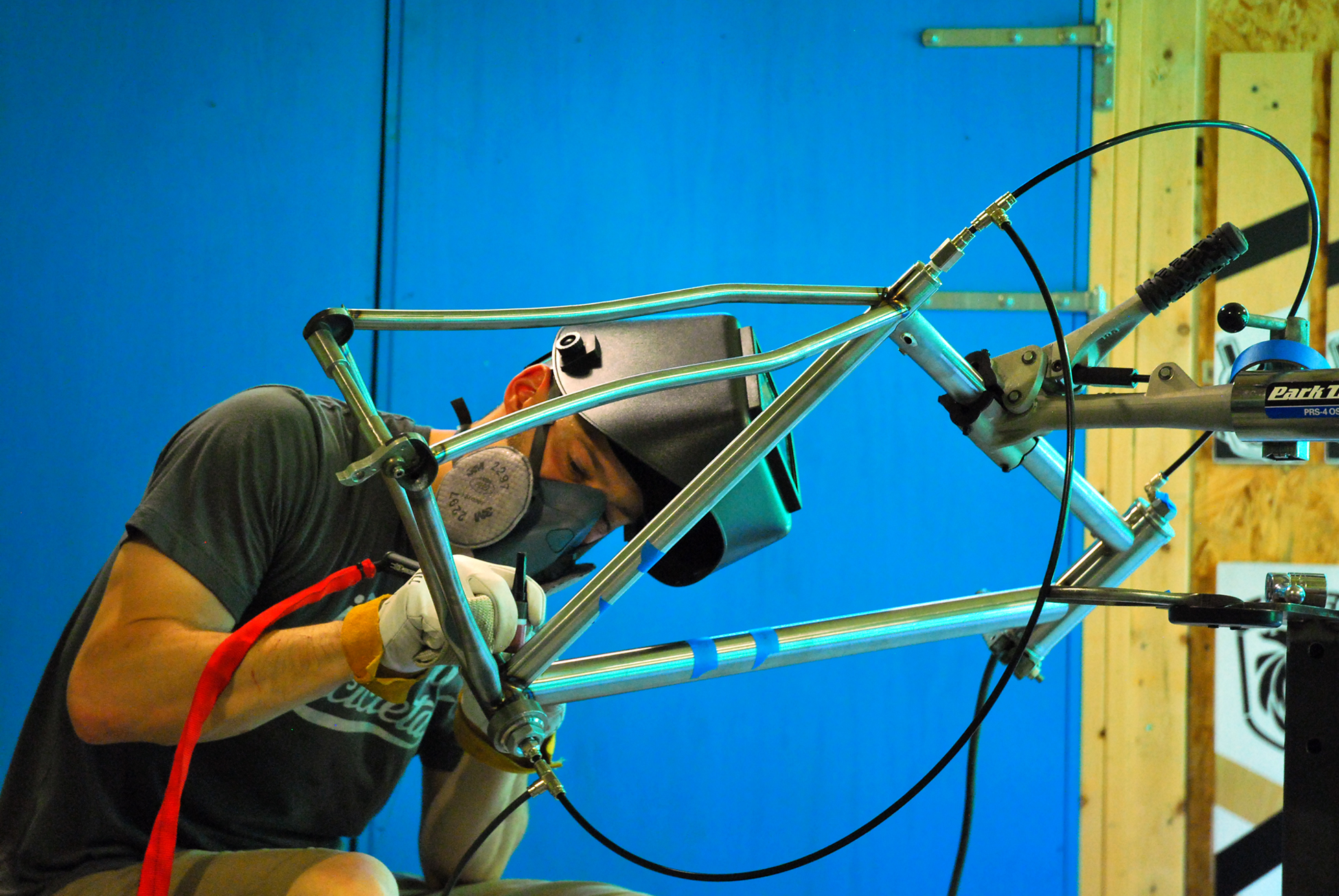
Pretty exciting day in the shop today... First time using my new back purge setup. STOKED.

-
 Re: Back Purge Love
-
 It's hot up here
It's been hot these past few days. And humid. May have to start welding at night. Despite that, I managed to get this one welded up this afternoon before heading out for a saucier than saucy ride.
 Posting Permissions
- You may not post new threads
- You may not post replies
- You may not post attachments
- You may not edit your posts
-
Forum Rules

 Likes:


 Reply With Quote








Bookmarks